The idea of mobile-responsive web design first rose to prominence with Apple’s release of the iPhone in 2007 and since then its usage has grown exponentially. In fact, worldwide mobile usage surpassed that of desktop in 2016 and the gap is only growing wider as time passes. Every day, companies are having their “mobile moment”, where mobile usage surpasses desktop.
With this in mind, it is critical that the design and development of new web apps truly consider the unique characteristics of mobile to ensure users have the best possible experience. In other words, if mobile devices are more popular, they need to be the primary focus during the website build.
So how can we best design and develop our websites to unleash the full potential of mobile? Here are 5 methods that can be used to give your mobile users a great experience on your website.
Mobile-First or Desktop-First?
When designing a web app for mobile and desktop, there are two key approaches: mobile-first and desktop-first. Mobile-first designs for the mobile screen size as the priority and then look to add elements as the screen width gets bigger. The process of gradually adding complexity is known as progressive enhancement. On the other hand, desktop-first is designed for laptop and desktop computer users first and then looks to remove elements without drastically changing the experience – this is also called graceful degradation.
I personally design and develop websites using mobile-first progressive enhancement. Primarily, the reason for this is that the majority of projects I work on have a mobile-first audience, so I want the project to align with my client’s user base. The second reason is it is easier to develop a mobile-first website as the static HTML structure of the page resembles the mobile version more closely than desktop.
Deciding which approach to use is important as it provides the foundation of your web strategy and highlights the strategic priorities of the organisation. Both methods have their merits and neither system is perfect. However, it is recommended to use audience analytics – both historical and forecast – and make a decision that best aligns with your audience.
1 – Organise Your Navigation
One of the critical parts of a good mobile user experience is to properly consider the user journey and build the navigation to support that sequence as well as possible.
Before creating a navigation, it is important to consider the main architecture of the website. As part of this, consider the purpose of the website and which pages the user is likely to proceed through to complete this process.
There are a few different models of navigation that can be used depending on the number of steps the user will go through to complete their objectives.
a – Off-Canvas Navigation
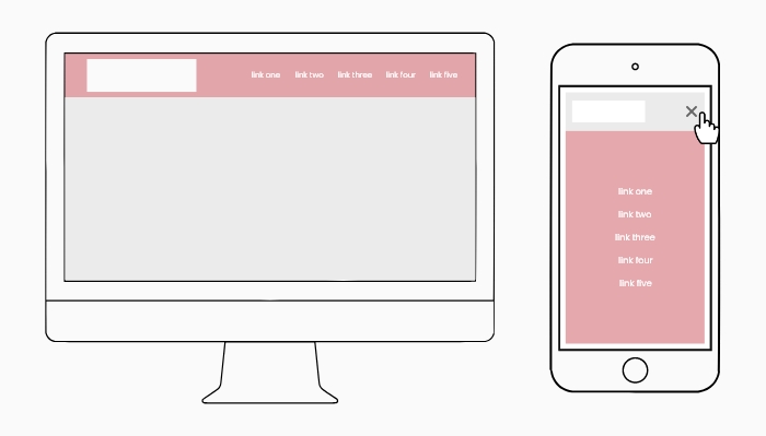
Off-Canvas Navigation On Desktop and Mobile
One issue on mobile is there is not enough space for larger, complex desktop navigation menus. A common solution to counter the lack of space is to create a slide-out, off-canvas navigation. With an off-canvas menu, the links are hidden from view and slide in when a navigation icon is clicked.
The links in the menu should be displayed vertically so as many links can be shown to the user on one screen. Each link should be sized and spaced to ensure the clickable area is easy for users to interact with. Considering the website’s critical pages is useful when deciding which links to include in the primary navigation menu.
More complex navigations with subsections can use an accordion style where the secondary links can be shown and hidden within the main menu. However, an accordion should only be used in exceptional cases as it adds complexity to the navigation and can hinder users from accessing critical pages.
b – Tabs and Floating Navigation
Some web applications have a more limited range of functionality, which allows the navigation to focus on a smaller selection of options. One option that can be used is a tab navigation with only the key pages included. Tabs mimic a native mobile app navigation as the links are fixed to the bottom of the page. The tab navigation is in view at all times, so maximises the accessibility for users to navigate to a specific page. Each link should have a descriptive, concise label and a graphical asset to make it easier for the user to distinguish each option.
Second, if the website is a single-use application, a floating navigation can be used. The navigation is located within a clickable button that is prominent in the design. By emphasising the navigation in this way, the user can easily carry out the main purpose of the app. Common single-use app actions are adding an event to a calendar, tracking a running duration or adding a task to a checklist.
The tab and floating options are specifically for web applications with limited options. If the website requires a larger range of options, an off-canvas menu may be more appropriate.
c – Content as Navigation
Some web applications can use the content of the page as part of the navigation. Content-orientated navigation is popular in consumption applications where users are looking for the new content provided e.g. social media and news websites.
Depending on the information, content as navigation can come in the form of a list, grid or thumbnail. Each content type provides a different hierarchy, which makes some elements more prominent, depending on the context. For instance, a thumbnail makes the image the largest element as it is key to converting the user. Alternatively, a list or grid has more prevalent text and a smaller image as the text is required to engage the user.
2 – Size and Scale Typography
Typography is a critical part of the mobile user experience as the information and guiding text are key to navigation and encouraging users to complete a specific action. It is therefore essential that the typography is sized so that users can read the text clearly as well as focus their attention on specific elements first. The approach to typography can be handled using two approaches: a typographic scale and fluid typography.
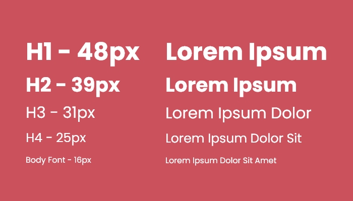
1.2 Minor Third Typographic Scale
A typographic scale is useful as it creates a visual hierarchy and allows users to focus on content in a specific order. We can style headings to be larger and draw the user’s attention initially. Medium-sized headings can then be used to provide secondary steps in the process and so on. With this in mind, we can channel the user in the direction of a specific user flow and increase the number of conversions on the website. To create a typographic scale of your own, go to typescale.com.
Second, fluid typography is when the font size increases gradually when the page is resized, which creates an illusion that it is fluid. Fluid typography works by setting a minimum size for mobile and a maximum size for desktop and transitioning between the two values. The main benefit of fluid typography is that font sizes are adapted specifically to the size of the device. One user could have an old iPhone 5 and another could have a newer iPhone 15 Pro. For each user, the font size is slightly different, which tailors the experience for each user’s device. I wrote an article about fluid typography where you can learn how it is created using CSS clamp.
3 – Create a Fluid Layout
Similar to navigation, creating a content layout that scales is one aspect of responsive web design. Fluid layouts concern a range of considerations that decide how the website adjusts to the device and provides the best possible experience. One of the most common methods of creating a responsive website is to use a responsive grid structure. Content of a website can be laid out in a grid with multiple columns and the number of columns increases as the device gets larger. For example, mobile usually is single-column and the columns could progress to two on tablet and three on desktop. The responsive columns can be created using common frameworks such as Bootstrap or Tailwind. Finally, the columns of the website can be aligned with the 12-column grid used by designers, which means the design theory can be applied across different devices.
Another way the layout can scale effectively is to use aspect ratios on image assets. Quite often, images are a key part of a design as they are the focus of attention for the user and can guide them through an application. It is therefore essential that the images scale across different device sizes and do not skew or crop. One way this can be achieved is by using aspect ratios such as 16 / 9 so the image is the same shape on mobile and desktop. CSS has an aspect-ratio property which can define the proportion of the element. The property combines the width of an image with the aspect ratio to calculate the height. For example, an image that is 1000px wide with a 2 / 1 ratio would have a height of 500px.
Another method of creating a fluid layout is to use percentage values. For example, an off-canvas navigation menu can be set to 100% of the height of the device. Using a full-height navigation menu allows the user to fully focus on the navigation elements without getting distracted. The percentage value allows the navigation to adapt to the device. Alternatively, a fixed height could cause the navigation to cut off on larger devices and be too long for smaller devices. Finally, we mentioned fluid typography earlier and this is perfect for fluid layouts due to the gradual increase in font size. The font size is tailored to the screen width, which allows headings to be seen and tap targets can be clicked easily.
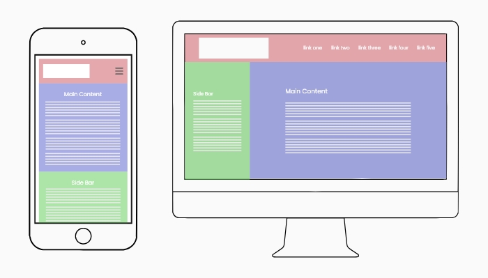
Fluid Layout on Desktop and Mobile
As we mentioned previously, organising the content of your website is an important step in directing users towards completing a specific goal. As mobile content is mostly single-column, the pages are longer and users are less likely to see content further down the page. With this in mind, the order of content on a page needs to be considered on mobile to ensure users view the most important content. One way content can be organised into a hierarchy is by switching the order of multiple-column layouts. For example, a two-column layout will break down into a single-column on mobile with the left column first, followed by the right column underneath. However, the order could be switched to show the right column first, if there is more important content to show the user.
4 – Harness Native Capabilities
The principles we have raised so far are suitable for responsive websites. However, there is a set of functions that are unique to a mobile device that can be used to enhance the user’s web experience. Starting with the camera, an image can be taken on a mobile device and then uploaded to a website. Additionally, AI can use the camera to scan a credit card and populate the details into a form on an e-commerce website. Both these features are more convenient than on desktop and provide a more efficient user experience.
Native Mobile Dropdown Select UI for iOS
Speaking of forms, smartphones have built-in native user interfaces for dropdown select menus, radio buttons, checkboxes and date pickers. Whilst there is nothing wrong with applying a custom design to a desktop select field, I would recommend using the native interface on mobile devices for maximum accessibility. A final point about forms is that ensuring the correct input type is set can have a big impact on mobile user experience. For instance, setting the type to “number” allows the traditional number keypad to appear on mobile devices when a user is typing in a numerical value.
Another distinct feature of mobile is the use of GPS data. Mobile devices are connected to a remote network, meaning web apps can make use of the location data of their users. One way the GPS data can be used is to create a smart default based on the user’s location. For instance, a map application could set the starting point to the current location. Alternatively, a form dropdown with a list of countries could be set to the current location. International businesses could serve users with a translated version of their website, depending on which part of the world they are from. Please note smartphones require the user to give permission to use their current location.
Native Gestures: Pinch Zooming and Horizontal Scrolling are Banned?
Finally, the website can make use of the touchscreen by factoring in native gesture-based interactions. Two common mobile gestures are scrolling horizontally and pinch zooming. Despite this, there are plenty in the design community who initially frowned upon these interactions as though they should be avoided.
The main reason pinch zooming was outlawed in some situations is because the content of the website should be sized appropriately so that the user does not feel the need to zoom in. The idea is correct in the sense it encourages critical content such as navigation and typography to be easily read and understood. That said, there are some instances where it is acceptable to use pinch zooming. For example, map applications make use of the pinch zooming gesture to zoom into content in a more detailed view.
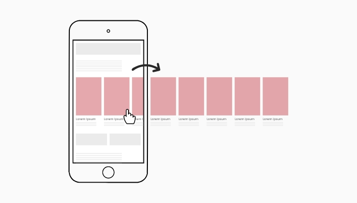
Native Mobile Horizontal Scrolling Gesture
Similarly, horizontal scrolling gets a bad reputation because the content of a page should fit within the width of the screen. Therefore, having to scroll horizontally is extra work for the user and it could mean key content is missed. However, horizontal scrolling is making a comeback in a more considered form. For example, side-scrolling content has become more popular as it can allow several content cards to be displayed whilst previewing an additional card. The extra card can be swiped horizontally to come into view. Displaying content in this manner can group relevant content whilst keeping the overall length of the page short and concise. Bear in mind there is no hover on mobile, so the native gestures are a great way to add interactivity to your website.
5 – Optimise for Fast Page Speed
Page loading times are a major consideration of any website build and are a critical part of a website’s SEO strategy. More acutely, mobile users are more likely to access a website when they are on the go and will be using their mobile network data. As a result, page speed has a special consideration for mobile as the website must be efficient with the user’s data allowance.
One of the main culprits for bloating a page’s loading times are images and videos. Large banner images look great on desktop but the HD images are unnecessary on mobile. When creating images, there should be a mobile version that is much smaller in dimensions and file size. Ideally, an optimisation tool such as Cloudinary or TwicPics can be used to generate a pixel-perfect image dynamically for smaller screens.
It is a similar story with videos as they are generally massive in file size and are overkill on mobile devices. Similar to images, different assets can be used for mobile and desktop so the mobile version is smaller in file size. Video and image assets below the fold can be lazy loaded so they do not load until they come into view. Lazy loading is most effective on mobile devices as the single-column layout makes the page longer and more assets are below the fold. The additional issue videos face is that some mobile operating systems disable auto-playing video, meaning the intended functionality can often break. To get around this, it would be better to use a still image on mobile and only use the auto-playing video on desktop.

Content Delivery Network (CDN)
As mentioned previously, mobile users are more likely to access a website when they are out going places. In some cases, users can utilise their mobile to access a website from a remote location. A website can use a content delivery network (CDN) to speed up the performance of a website. Essentially, a CDN copies the files of a website to several servers all over the world. The page speed is enhanced because the website will load from a server that is physically closest to the user’s location. Feel free to check out my blog post for an in-depth look at page speed.
Bonus: Test, Then Test Again
All of the points raised so far are broad principles that put your website in the right direction of providing a great mobile user experience. However, I want to change gear and approach mobile UX from a slightly different perspective. The truth is there is no one-size-fits-all approach to mobile UX. Different solutions can work in different situations, depending on the use cases. In terms of your website, there is only one way to be sure your mobile strategy is working as expected: testing.

Process of Creating a Mobile Web Strategy
Once we have implemented several key aspects of mobile design, we want to ensure our changes are working as intended for our mobile users. When developing a website, a good starting point is to use a browser mobile emulator to preview the website in mobile mode. The emulator allows developers to cost-effectively test the website on a range of different device sizes and identify any issues that occur.
Once the initial version of the website is complete, it would be a good idea to test it on a range of mobile devices. If possible, test on each of the major smartphone brands so different operating systems can be tested for any unique bugs. Testing on a real device allows the website to be checked more organically by giving users access to native controls. Also, giving users access to the real device allows the placement of key elements to be tested to see if they can be clicked easily.
More broadly, the best way to test a website is usability testing. Getting real users in front of the website and testing how effectively they can complete their objectives. Usability testing is the best way to uncover issues that users are having. The issues uncovered will likely be related to one of the five principles discussed previously. Once the issue has been uncovered and a solution has been put in place, test again to confirm the user can complete their tasks with as little friction as possible.
Wrap Up
Mobile usage is going to continue to grow rapidly and the principles discussed will put your website in the right direction. It is likely your “mobile moment” is coming in the near future – if it has not already happened. Putting in some initial groundwork to consider and order the key pages of your website can provide a solid platform for your mobile-first strategy going forward. It is also more than worth your while to conduct some usability testing to determine where improvements can be made.
Whilst each principle is distinct, there is plenty of overlap between them and they combine to create a robust mobile user experience. For instance, scaling typography can be part of the navigation when using content as navigation. Similarly, the choice of navigation menu can be part of a fluid layout that is tailored to each mobile device.
Coupling your website with the unique functionality of mobile can provide a great user experience and ultimately provide you with more positive outcomes. Gearing your website towards mobile is a great way to engage with the audience of today – and tomorrow.