The design process is overflowing with a vast array of tools with varying capabilities and price tags. It can often be overwhelming with so much choice and it can be confusing when some tools claim to do various overlapping sections of the design process.
Would it not be good if each of the key stages of the design process were defined once and for all? Well here it is…
Wireframes

Wireframing Software | Balsamiq Mockups
In the beginning of a design project, after you have received your client brief, the first thing you want to do is take a pencil out and sketch out a rough design on paper. This drawing highlights the key content areas of the website such as navigation, images, text areas, buttons and so on.
A wireframe is usually low fidelity as it requires the viewer to use their imagination in terms of visualising the final solution. A wireframe is the bare bones of a piece of work and provides a platform to build on for the project going forward. A well-designed wireframe allows the main content architecture to be laid out before a client. It offers an opportunity for scrutiny early doors, as it is always better to make a layout change in the beginning before the design becomes more complex and harder to alter.
At this point, we care most about defining what content will appear on the page and in what order. You may wish to digitalise your sketches using wireframing tools such as Balsamiq, Wireframe.CC and Mockflow. In general, wireframing tools are cheaper than their mockup and prototype counterparts. There are even some free tools that are more than capable of doing the job, such as Pencil Project.
Mockups

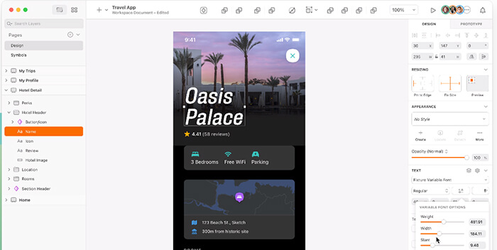
Mockup Software | Sketch for Mac
The next phase of the design process is to continue to build on your initial design by adding design elements such as colours, fonts and images. We want to build up our design to a point where we have a static snapshot of how the final solution is going to look. Providing a client with a piece of work in this manner allows the functionality of the design to be provided in a static way.
At this point, you want to visualise how a UI is going to appear, and analyse the intuitiveness of the design. In short, the end user should be able to have an understanding of the functionality of a piece of content from only visual interaction.
It is also worth noting that some mockup tools allow work to be shared with clients and and potential end users, these tools can also provide commenting functionality so that additional context can be provided, such as hover states and animation. This is useful as it allows the client to have a greater understanding of the intended functionality of the end product and allows any issues to be resolved before a fully-fledged prototype is produced.
A mockup is usually mid to hi-fidelity as they often include more fine grain design features such as background colours, gradients and drop shadows. Sadly, some designers decide to skip the mockup stage, however it provides a great opportunity for a team of stakeholders to discuss key aspects of the visual design. Mockups allows for the visuals to be decided before the interactions can be implemented.
When it comes to pricing, mockups are more expensive than wireframes, due to the increase in capability. Do your research before making a purchase: take a look at features list and decide what is for you. An increase in features will inevitably mean an increase in price, however it is only worth paying the extra money, if you are making full use of the functionality available. Common digital tools that can be used to create a mockup are Photoshop and Sketch.
Prototypes

Prototyping Software | Adobe XD
Finally, we reach the last stage of the design process, when we create a prototype. We take our mockup design and we add interactive behaviours to our work to provide some depth. In other words, a prototype gives the user the ‘touch and feel’ dynamic.
Common interactions can include hover and active behaviours on content such as buttons. Prototypes can allow links to be built between screens, providing an opportunity to test the UX of navigation. Top of the range prototypes can also integrate slideshows and animations to provide the user with an unparalleled understanding of the final solution.
Prototyping is a great opportunity to conduct effective usability testing and get a strong understanding of how your design will survive when it is out in the wild. It allows the key target audience to engage with the solution that has been created, which evokes far more valuable user feedback.
When it comes to cost, prototypes are the most expensive in this field. Have a shop around at the various options available. Take a free trial and see what works best for you. There is a plethora of software that provides prototyping functionality, such as Axure RP, Webflow, Adobe XD and Invision.
Conclusion
The main thing to take away from this article is to understand the role that each stage of the design process plays and how to get the most out of each. When it comes to choosing which tool to do each job, it is wise to make a decision based on your skills and experience – and your budget.
By understanding each stage in detail, you can customise your design process in order to make it work better for you. If you are strapped for time, perhaps paper mockups are more suitable than a digital version. If money is an issue, perhaps get software that offers mockup and prototype functionality.
In short, there is nothing wrong with using software that covers more than one section of the design process – provided you can make the distinction between them.