


CSS clamp is a modern CSS function that lets you add fluid typography to a website with a single line of code. CSS clamp works by defining a desktop font size and a mobile font size and gradually transitioning between the two values. The middle value allows the transition to take place using a dynamic measurement such as viewport width.
For most users, the CSS Clamp Generator will suffice for your needs. However, for those wanting to know what is going on behind the scenes, here is a quick explainer. First, we need some sample values to do the calculation:
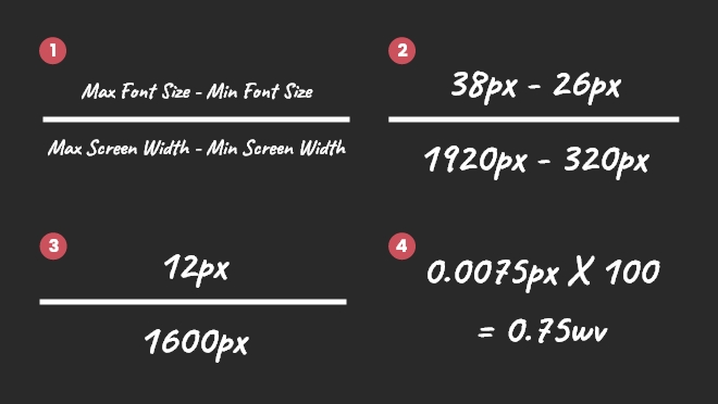
- The minimum font size is 26px.
- The maximum font size is 38px.
- The minimum screen width is 320px.
- The maximum screen width is 1920px (HD).
Get the Viewport Width
The first part of the calculation takes the maximum font size and subtracts the minimum font size. Then, deduct the minimum screen width from the maximum screen width. Next, divide the difference in font sizes by the difference in screen width.
For example, 38px minus 26px is equal to 12px and 1920px minus 320px equals 1600px. Then, 12px divided by 1600px equals 0.0075px. In context, this means that each time the screen width increases by 1px, the font size should increase by 0.0075px. To convert this value into a dynamic value, multiply the number by 100 to get 0.75vw.
Calculate the Viewport Width
Starting Point of the Dynamic Font Size
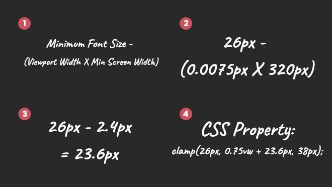
The second part of the calculation is to work out the starting point of the dynamic font size – as the minimum screen width is not usually 0px. First, we want to multiply the dynamic viewport width we calculated earlier by the minimum screen width. Then, we want to take the minimum font size and deduct the starting point we just calculated.
Calculate the Dynamic Font Size Starting Point
For example, the font size per viewport width of 0.0075px multiplied by the minimum screen width of 320px equals 2.4. Then, the minimum font size of 26px minus 2.4px equals a dynamic font size starting point of 23.6px.
The final font-size value would be “clamp(26px, 0.75vw + 23.6px, 38px);”, which allows you to use fluid typography and have font sizes that are tailored for every device.
What’s the Chat?