


One of the key features of Figma is the ability to create reusable colour styles. When designing a website, app or assets for blog or social media content, colour palettes are a key part of the design. They are critical to establishing the mood of the design as it is one of the first things a user will see and can create a positive initial impression.
Once a colour palette has been selected, it can be applied to a design in the form of background colours, buttons, text colours and icons. When designing a user interface, it is useful to store the colours independently, so that elements using the same colour can be grouped together. This means that should you require a small tweak to the colour later on, you can update the colour of all the elements throughout your design at once.
Adding a Colour Style
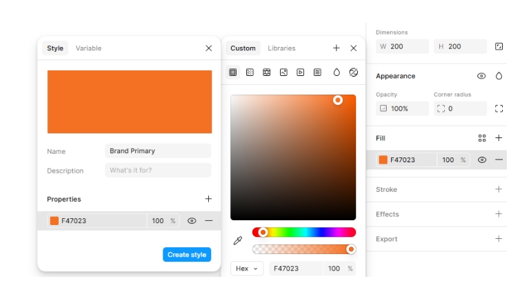
Create an element on the canvas, such as a rectangle and then add a fill colour of your choice. With the colour selected, click the plus icon to add a new colour style. In the popup, add a name for your colour and then click the “Create Style” button.
Naming Conventions in the Colour Style Collection
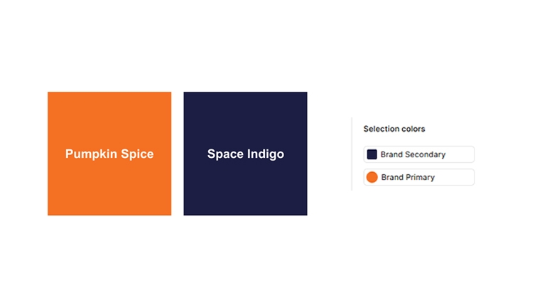
In simple designs, the names in the style guide could match the name of the colour i.e. red, green, yellow etc. More advanced designs could use more general names such as primary or secondary, so the names are transferable from project to project. Second, they can be grouped by function, such as brand, feedback etc. This way, the colours of the business can be separated from general application success / failure colours.
Using the built-in colour style features in Figma makes your design more visually consistent and enables you to create new content more quickly and implement client amendments more efficiently. Now that you know the colours of the project are taken care of, you can focus on other aspects of the design in the extra time you have saved.
What’s the Chat?