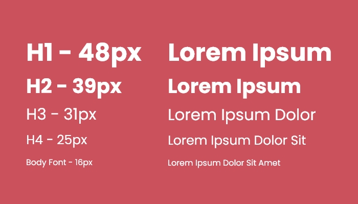
Typography is a key part of the mobile user experience as we can use headings and guiding text to direct users towards completing a specific goal. It is important to ensure that the text is sized so all users can read the text clearly and focus their attention on specific elements first. There are two main methods of applying typography to a website: using a typographic scale and fluid typography.
Typographic Scale
The main idea behind a typographic scale is to create a visual hierarchy by making the important headings progressively larger. For example, the largest headings can be used for the primary action of the web page and smaller headings are used for secondary actions. This way, the user is channelled in the direction of specific content and is more likely to complete a conversion. To create a typographic scale of your own, go to typescale.com.

1.2 Minor Third Typographic Scale
Fluid Typography
Fluid typography allows the font size of an element to gradually increase from a smaller size on mobile to a larger size on desktop. As a result, each device has text elements that are optimised for the size of the device. For example, the text size of a heading would be slightly different if the device was an old iPhone 5 compared with an iPhone 15 Pro.
Fluid typography can be implemented using CSS Clamp. I wrote an article where you can learn how it is created using CSS clamp.
Now, your website can have strong visual hierarchy and you can start earning more conversions from your users.


What’s the Chat?