New Branding and Logo Creation
A new brand was created for Money Tree and a new logo was one main part of the new identity. The logo was created to visually represent the new digital product and would be used on the web app as well as social media and various branded merchandise.

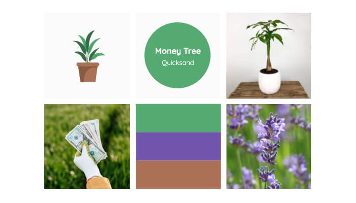
Mood Board | Money Tree
The colour of green was selected due to the cultural association with money and personal development. The logo also features small amounts of brown, which has a cultural association with strength and reliability. Finally, completing the triadic colour palette was purple, which adds elegance due to the historical ties with royalty.
The app is primarily aimed at young adults as they statistically require the most help with their finances. The typeface of Quicksand was selected as it is youthful, playful and relates to the younger target demographic.

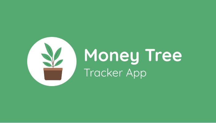
New Logo Design | Money Tree
The main visual element of the logo was an illustrated money tree. The plant was selected as it has connotations of natural growth. It is also a play on words as the purpose of the app is to help users with their finances. The logo was designed by Sean Hervo.

Branded Mug Merchandise | Money Tree
Some branded products were created to make the conceptual digital product more immersive. The merchandise was selected to be suitable for customers tracking expenses such as branded pens, notebooks and mugs.
Web App Design
Research into potential solutions was conducted on Pinterest where suitable website examples were saved to a board for future inspiration.
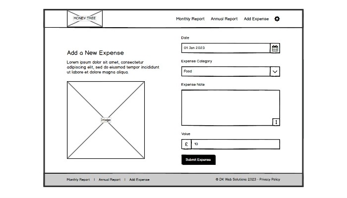
The initial version of the web app was created using paper sketches to define the key screens and the content living within each screen. The paper sketches were created in digital form using Balsamiq Mockups. The wireframes were used to define the user journey of logging in, adding expenses and viewing the report screens.

Balsamiq Mockups Wireframe | Money Tree
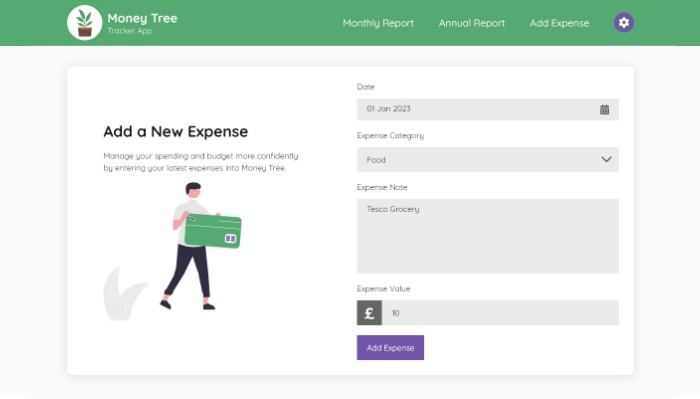
The final mockup of the application was created with Adobe XD, which allowed extra elements to be added such as typography, colour, imagery, spacing and shadows. The component feature allowed the reuse of design elements such as navigation, footer, form elements and buttons, which increased the speed of the design process.
Developing the Adding Expense Screen
The website was built using PHP to create the key screens and a MySQL database was used to store various information such as expenses and categories.
The application contains personal information for its users, so the website is secured by requiring users to log in to access screens with personal information. The website sanitises the user input to prevent unauthorised access to sensitive data.

Adobe XD Mockup | Money Tree
The action screens were designed to be a simple form for the user to quickly fill out to enter their expense information. Small changes were made to the design as a result of testing such as:
- Defaulting the date to the current date as it is the most common use case.
- The date picker was created using the JavaScript library FlatPickr so that the user can select a date using the mental model of a calendar.
- Setting the default category to food as it is the most common category.
The website uses the database framework Medoo to handle any interactions with the database such as inserting, updating and deleting expenses and categories.
Developing the Monthly and Annual Report Screens
The application required the expenses to be processed and shown in two data table reports. One monthly table shows income and expenditure for one month in the style of a bank statement. The monthly report allows spending to be monitored in real-time and the remaining cash for the month can be budgeted.

Web Application Screens | Money Tree
The second main report in the app is the annual expenses, which was created in two formats for two scenarios. The first screen shows the expense category totals for each month of the year in the form of a table. This screen allows data-focused users to view the total income and expenditure for each category as well as the average spent each month on a specific category.
The second screen on the annual report shows the data in a chart format using the JavaScript library Chart.js. The chart view was created to allow users to identify trends and spot where savings can be made or income could be maximised.
There is a demo of Money Tree available for anybody who wants to try the app out – just send me a message on my Contact page.
End Outcomes
Following the completion of the development stage, I have used the app to add my expenses and monitor my finances more effectively. I have since noted some areas of improvement with new features that can be added such as recurring expenses i.e. rent, government taxes. This has been a good UX experience as it is identifying issues with the software and making suitable changes to improve the overall experience.
The project was another positive exercise in improving my design skills using Adobe XD to create a new brand from scratch and then apply the branding to a new application and branded merchandise. The design process was also refined with the addition of Pinterest inspiration boards and Adobe XD components.
Finally, the development of the app has greatly improved my PHP development skills by storing and processing large amounts of information and displaying it in a way that is manageable for users to understand. Creating an application that is secure and easy for the user to utilise has been a great challenge to overcome. Overall, I have gained some design and development skills and also now have a handy expenses app to use as well.