Project Brief
Caledonian Airlines was created as part of the UX Design Diploma provided by the User Experience Design Institute. The course was structured to follow the lifecycle of a real-life UX project by beginning with extensive user research, followed up by analysis and design. The course was a mixture of lectures, which detail the theory behind UX design and several practical projects that apply the lessons from the lectures.
The project objective was to create a web application that understands common usability problems and provides customers with a great user experience to give the airline an advantage in a competitive market.
Research Conducted
The research was conducted at the start of the project in order to understand the issues that customers were having when using competitor airlines’ applications. The understanding gained from the research can be used in the design stage to directly address some of the issues that the user was having in order to provide an improved user experience.
Research that was carried out includes:
- Competitor Benchmarking
- User Surveys
- Depth Interviews
- Usability Tests
Competitor benchmarking was done to understand how other airlines solve the problem for their users and understand what could be emulated in my design. I used Survey Monkey to create a user survey, which was used to understand what tasks the user wanted to complete on the website and if they encountered any issues doing so. I used a mixture of structured and unstructured questions so the surveys produced quantitative and qualitative data.

Usability Testing | Caledonian Airlines UX Design
Depth interviews were used to gather the additional context of the user’s travel experience and where the web application could solve some of the problems that arise. Finally, usability testing sessions were used to gain insight into customers using two competitor airlines. The sessions were recorded so that detailed notes could be taken on the user’s goals and behaviour. Usability testing was the best research method because it provided direct access to the user’s experience and detailed insights could be observed from their behaviour and responses.
Analysis
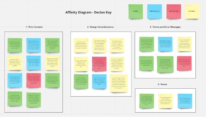
The raw data from the research stage was then collated and organised into an affinity diagram. This approach enables vast amounts of information to be collated into manageable groups and broader, strategic insights can be collated.

Affinity Diagram | Caledonian Airlines UX Design
The initial affinity diagram was created using sticky notes and a whiteboard because it was the quickest way of getting all the research insights into one place. The insights were organised into groups based on various stages of the user journey e.g. flight search, flight results, baggage etc. However, some categories were more broad such as forms, error messaging and general aesthetic design considerations. The final version of the affinity diagram was created using Miro so the final product is more visually pleasing as the text is easier to read.

Customer Journey Map | Caledonian Airlines UX Design
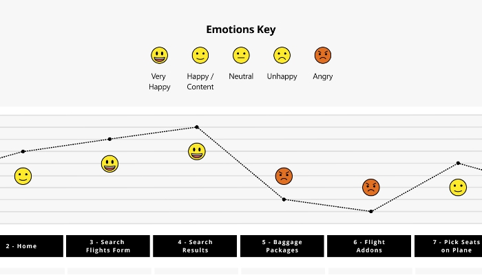
The findings of the affinity diagram were then articulated using a customer journey map. This approach was used as it enables the findings of the affinity diagram to be presented in a more structured model. The other reason this method was used was that it visually represents the user’s overall emotion at each stage of the user journey. Therefore, specific areas where the user has issues can be identified more easily.
The user has issues with two parts of the process:
- Baggage Packages
- Flight Addons
The main issues that were uncovered were that the airlines used baggage packages that were not clear in explaining the services that were provided. Users either did not know what the service was or did not want the service. The other area of concern was that the airlines had too many extra services such as speedy boarding, insurance, car hire etc. Customers felt irritated and thought the add-ons are time-consuming.
The high-level flow of the user was then highlighted in the user flow diagram, which defines each screen state, user action and any decisions the user might make. Breaking the process into each individual step allows every interaction to be considered, which is then used to build into a positive user experience when booking flights. User decisions were factored into the flow where some shortcuts could be taken e.g. flight preferences could be saved from previous use.
Medium-Fidelity Prototype Design
Finally, a design was created using Adobe XD, which solves the issues that arose in the research phase. The medium-fidelity prototype guides the user through each of the key stages of the flight booking process:
- Flight Search
- Flight Results
- Baggage Packages
- Additional Extras
- Checkout
To ensure the experience of viewing the prototype is as simple as possible, the following information should be noted before the prototype is used:
- Locations – Edinburgh to Madrid.
- The early flight is preferred on the outbound flight.
- The later flight is preferred on the return flight.
- Dates – 20th December to 27th December.
- Passengers – Two Adults.
- Baggage – Hand luggage and at least 12 kg case.
- Extras – No meal is required and standard seats (H4 & H5) are to be selected.

Adobe XD Medium-Fidelity Prototype | Caledonian Airlines UX Design
The design solves the problem related to baggage packages that arose in the research by using words in plain English to describe the service being provided. Each service was accompanied by a relevant icon, which helps the user to identify the service more easily. Finally, the packages were ranked from the smallest service offering to the largest so it is clear that the customer will pay extra for the advanced package and they understand clearly what they are paying extra for.
Secondly, the issues related to the additional services were solved by cutting down the number of extra options provided. The customer is presented with a yes / no checkbox asking whether they would like an in-flight meal and whether they would like to pick the seats on the plane. The process was greatly simplified by removing any irritating questions such as travel insurance, carbon offsetting tax and charity donations. The customer can quickly select the options they want and then swiftly move on to the next stage of the process.
After the design was created, additional usability testing was conducted to test the solution that was created. Overall, the new solution solved the problem that users were having as they understood the baggage packages and were not frustrated by the additional add-on questions.
Finally, the designs were annotated with page information such as controls, rules and feedback on each interactive element, which helps with the designer/developer handover process.
End Outcomes
Overall, I learned that UX design is a research-based discipline that is focused on solving problems that the user has with a digital product. The course is a fantastic opportunity to follow the entire lifecycle of a UX project with practical lessons in the key stages of research, analysis and design.
The course provides a detailed set of lectures, which allowed me to build up a strong understanding of the theory behind UX. After the project was finished, I passed the exam with a score of 92% and received my professional diploma in User Experience Design.