New Branding and Logo
The Cou Cou Corner required the creation of a new brand, including the creation of a new logo. The logo introduces the concept of the cocktail bar as a speakeasy, so the external sign indicates that the company is a fishmonger. The custom illustration of the fish was created by Alex Ashman. The flying fish was chosen because it is the national animal of Barbados and ties in with the fishmonger concept.
The colours of blue, yellow and black are the national colours of Barbados, which ties in with the Caribbean theme. The colours are tropical and add to the exotic, vibrant feel of the design.

Shop Exterior Logo | The Cou Cou Corner
The typeface Kalam was selected as it is playful and inviting and relates well to the bar’s quirky appeal. Montserrat was selected for the body text as it is an easy to read sans-serif font that makes it easier for the user to consume the content on the website.

Welcome Information | The Cou Cou Corner
The initial basic wireframes of the website were created using Balsamiq Mockups to outline the basic structure of the pages. The wireframes were then brought to life in the form of a mockup using Adobe XD: adding colours, typefaces and imagery. Additional prototyping features were added, again using Adobe XD, such as page navigation and subtle animations.
Landing Page CSS Animations
The Home page landing screen was developed with several CSS keyframe animations to add charm and fun to the website.
Key animated elements include:
- The boat is navigating from left to right.
- The calm ocean gently rocking.
- The sun gently pulsing.
- The clouds slightly swaying in the wind.

Landing Page Animation | The Cou Cou Corner
Overall, it creates a relaxed atmosphere, which indicates the vibe customers will have when visiting the bar. The underwater bubbles effect creates a more immersive experience for the user to engage with.
Menu Content Research
A key part of the website is the menu; extensive research took place to ensure that the menu features authentic snacks that are from Barbados and the wider Caribbean.
Additional research was carried out to ensure that several alcoholic drink categories feature options that are from Barbados such as native beers, wines and of course, rum! The website headings also feature several real-life Bajan (local dialect) expressions.

Rum Cocktail Menu | The Cou Cou Corner
Mobile-Responsive Bespoke WordPress Theme
The website was developed using WordPress so that the content can be easily maintained to keep content fresh in the future.
Adobe Photoshop was used to create any custom graphic assets, such as the custom map of Barbados on the About Us page.

About Us and 404 Mobile Mockups | The Cou Cou Corner
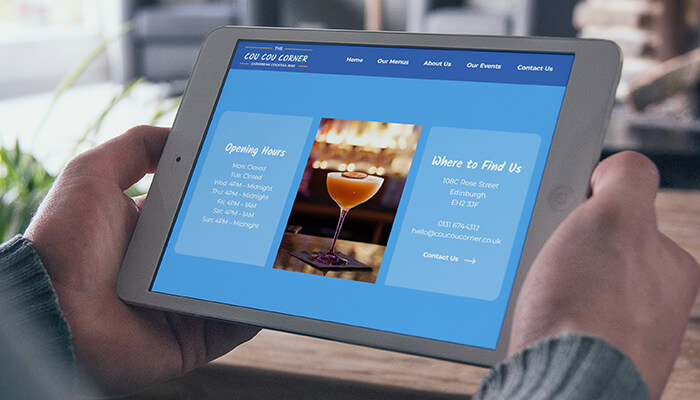
The website is optimised for all device types, meaning the user has a great experience on mobile, tablet and desktop. The website also makes use of an SSL security padlock, meaning it is safe and users can trust in the security of the website.
End Outcomes
The project greatly enhanced my digital design skills with the creation of a new branding identity such as a new logo and colour palette. It was great fun researching the food, drink and culture of Barbados and improving my copywriting skills in the process.
The custom CSS animations on the landing page, water bubble effect and fade-in animations brought polish to the user experience that will be emulated in future projects.